Chart Templates for Every Use Case
Start with a pre-built chart type and customize colors, fonts, and layout to match your brand.
Chart Templates for Every Use Case
Start with a pre-built chart type and customize colors, fonts, and layout to match your brand.
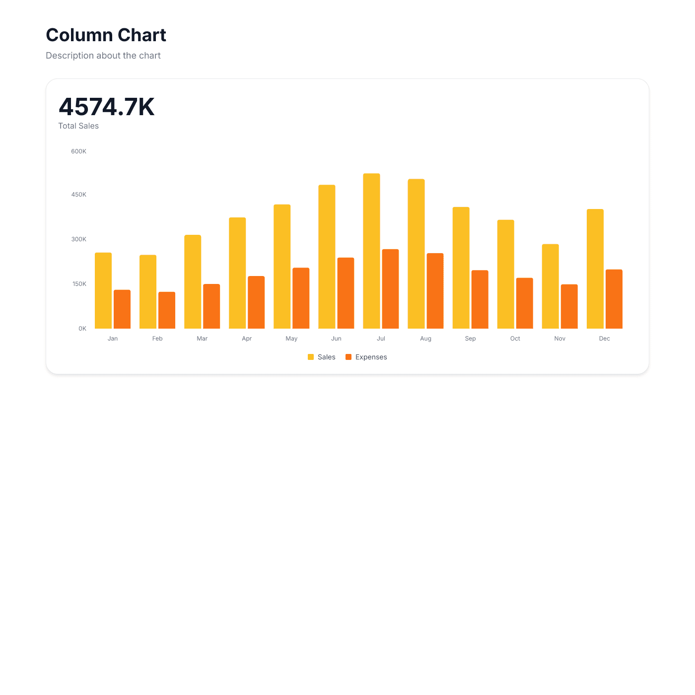
Column Chart
Compare values across categories with vertical columns. Great for monthly reports and category comparisons.
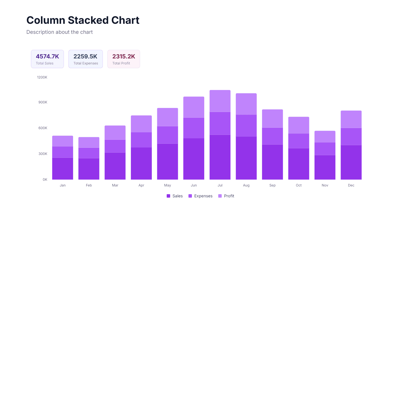
Stacked Column
Show part-to-whole relationships stacked vertically. Ideal for breaking down totals by subcategory.
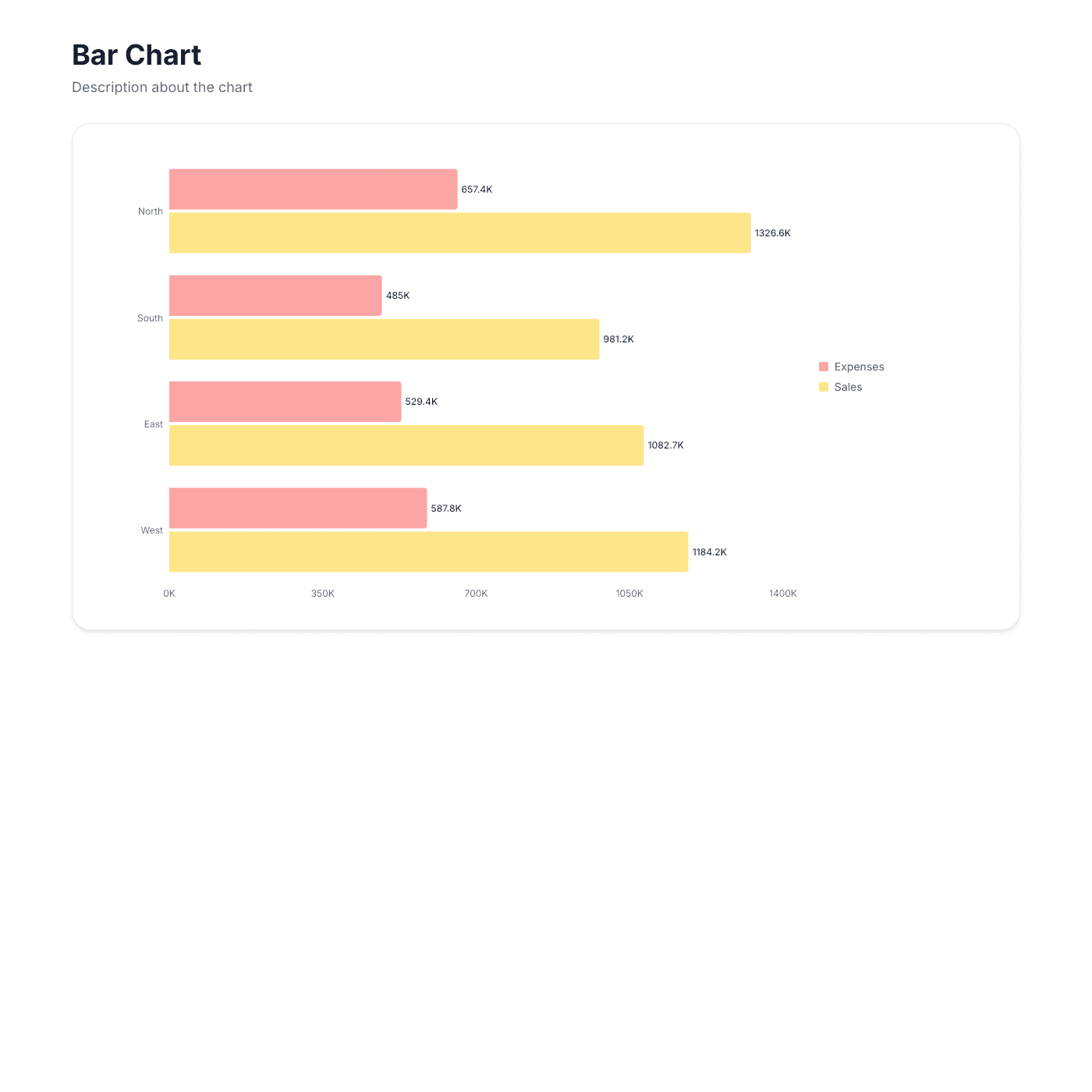
Bar Chart
Compare values across categories with horizontal bars. Perfect for ranking and leaderboard displays.
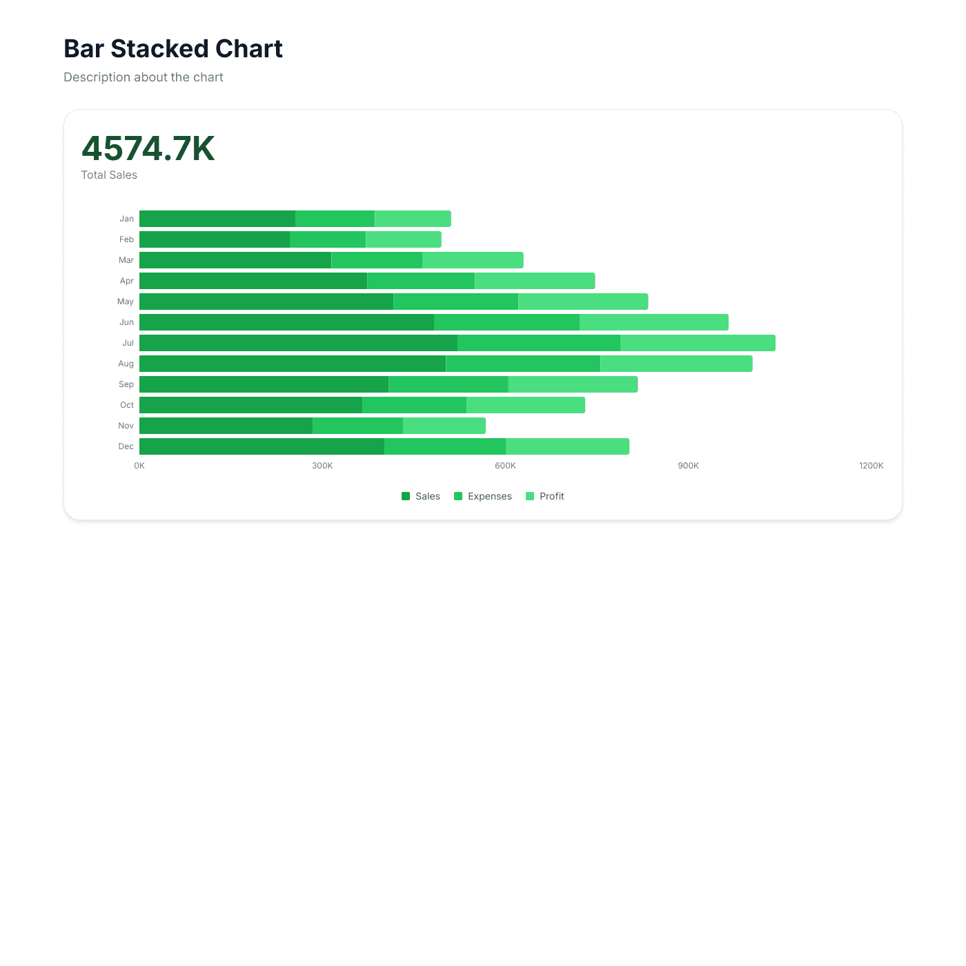
Stacked Bar
Show part-to-whole relationships with horizontal stacked bars. Great for budget and resource breakdowns.
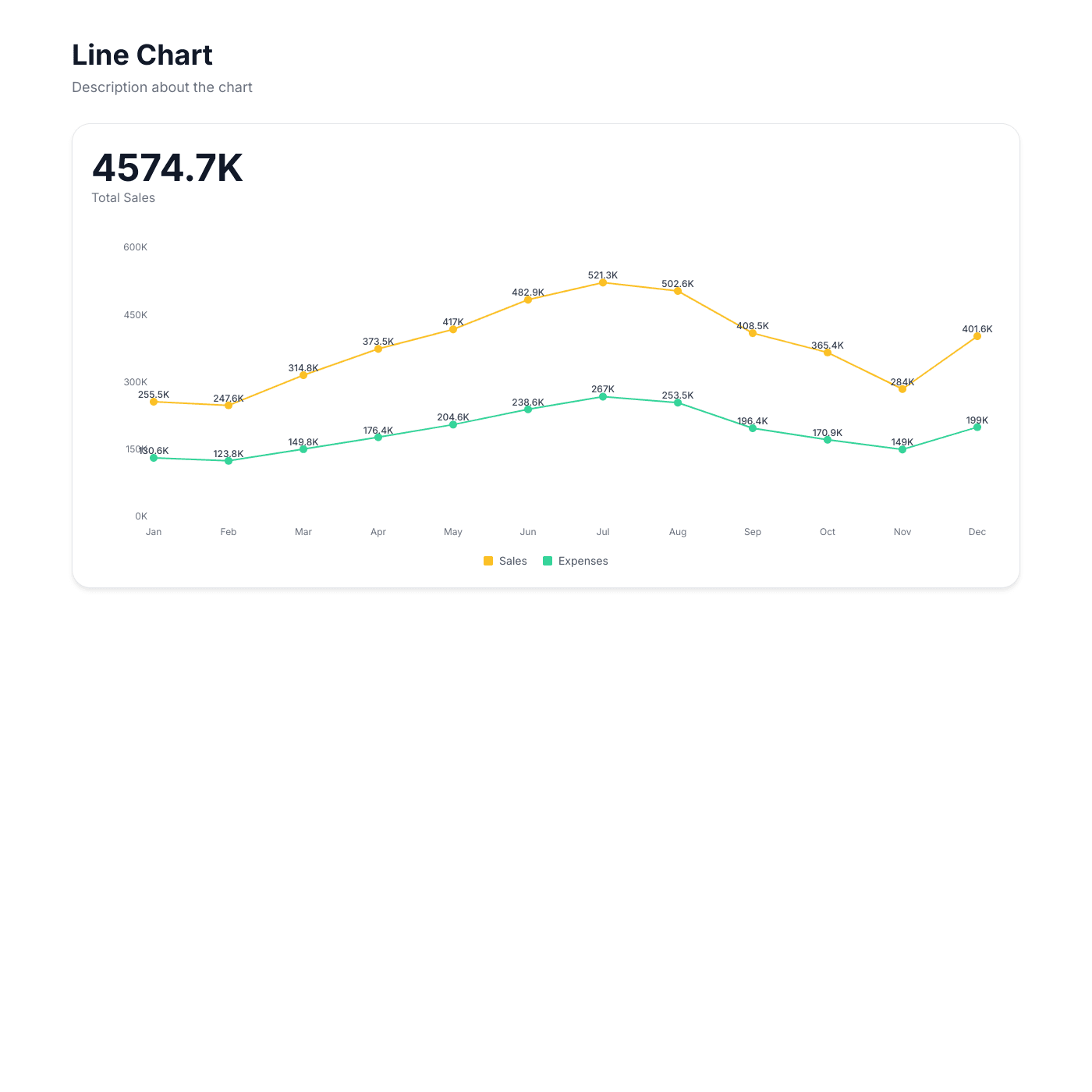
Line Chart
Visualize trends over time with connected data points. Ideal for tracking growth, revenue, and KPIs.
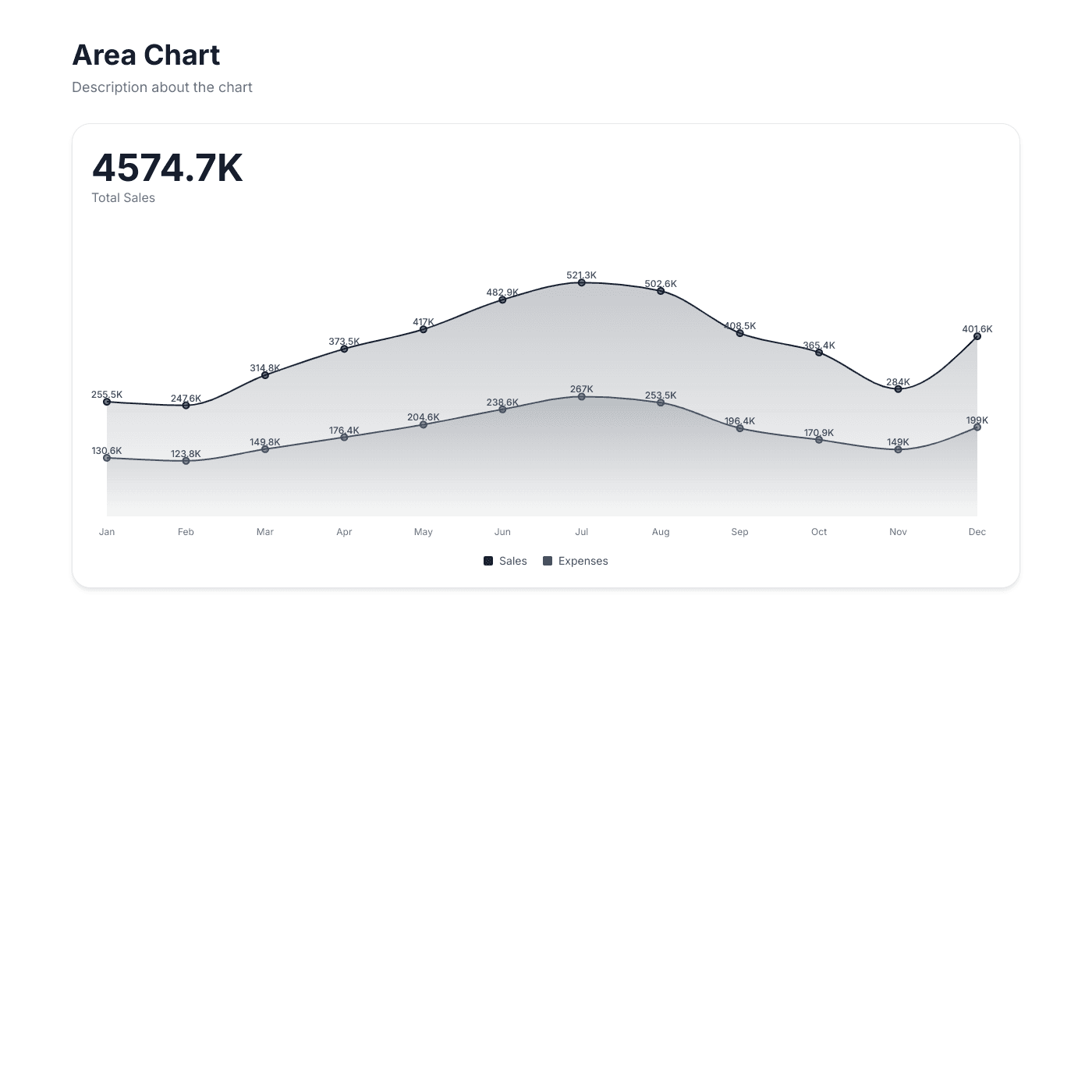
Area Chart
Show trends with filled areas to emphasize volume. Perfect for visualizing cumulative data and comparisons.
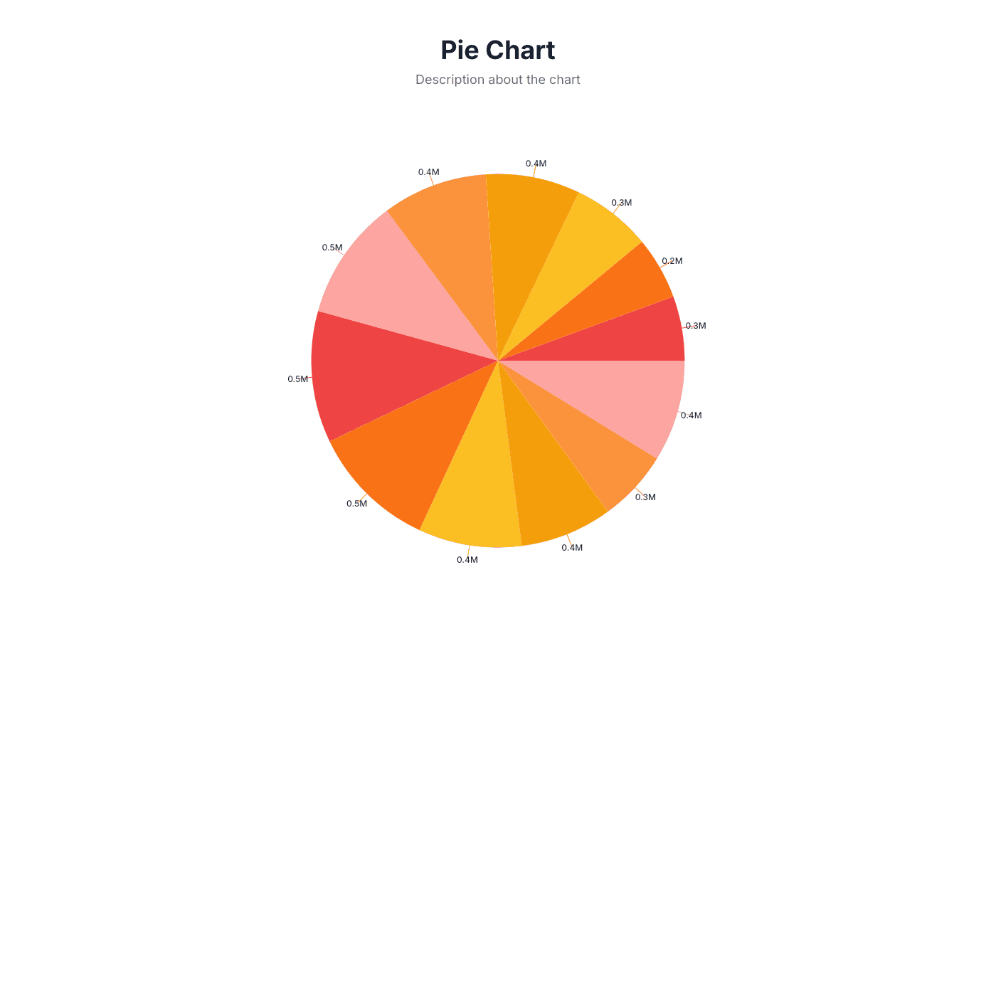
Pie Chart
Show proportional distribution across categories. Best for market share, budget allocation, and survey results.
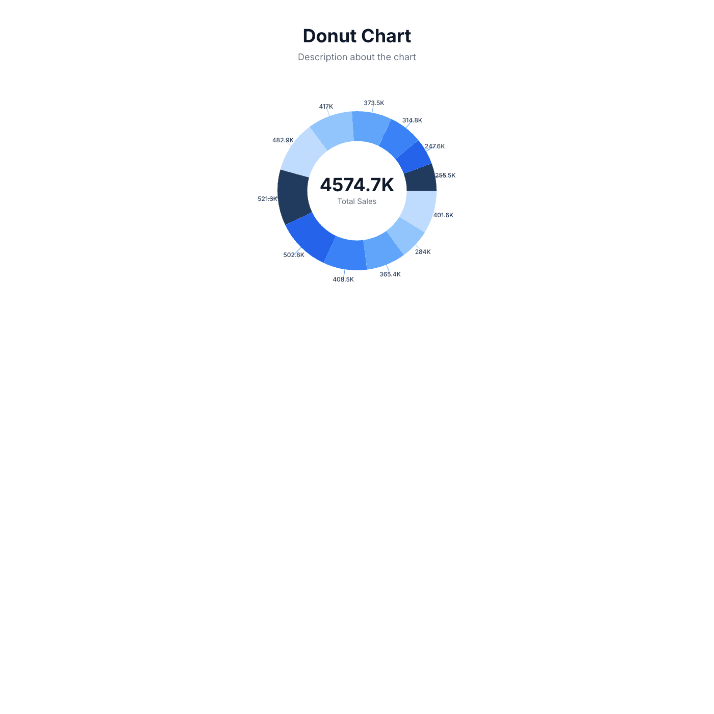
Donut Chart
Show proportional distribution with a ring shape. A modern alternative to pie charts with space for a center label.
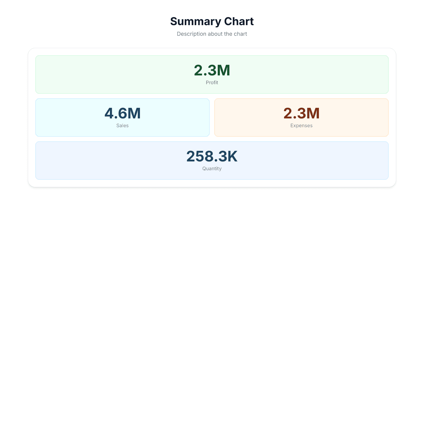
Summary Grid
Display key metrics as headline numbers in a grid. Perfect for KPI dashboards and at-a-glance reporting.
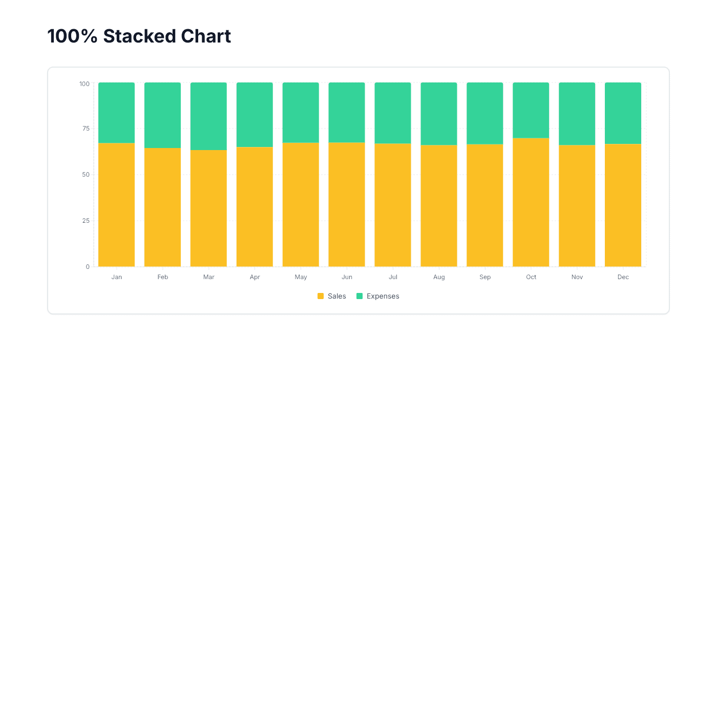
100% Stacked Column
Compare proportional contributions across categories. Shows each category as a percentage of the whole.
How It Works
Choose a Template
Browse our collection and pick a template that matches your style and use case.
Connect Your Data
Link your Airtable or Google Sheets to populate the template with your content.
Customize & Publish
Adjust colors, fonts, and layout to match your brand, then publish to your website.