Add interactive Charts to any website
Turn your Airtable or Google Sheets data into beautiful, interactive charts. Bar, line, pie, area, and more. Embed on any website in minutes.
Works with all website builders, e-commerce platforms, and websites.
Create your Chart Widget
Configure your widget and add it to your website for free!
Select a template to preview
Shareables Chart Widget turns your Airtable base or Google Sheets data into interactive charts you can embed on any website. Create bar, line, pie, and other chart types that update automatically when your spreadsheet changes — no coding required.
Why teams love the Chart Widget
Turn spreadsheet data into visual stories.
Use Airtable or Google Sheets as Your Data Source
No need for complex BI tools or custom dashboards. Connect your Airtable base or Google Sheet and your chart updates automatically when the data changes. Add rows, update values, or reorganize columns — your chart reflects the latest numbers instantly.
“Shareables was the missing link between Airtable and our website.”
Casey
Nexus
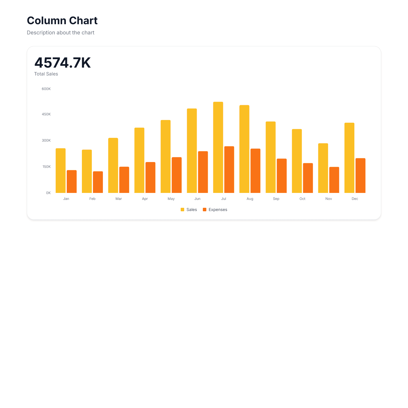
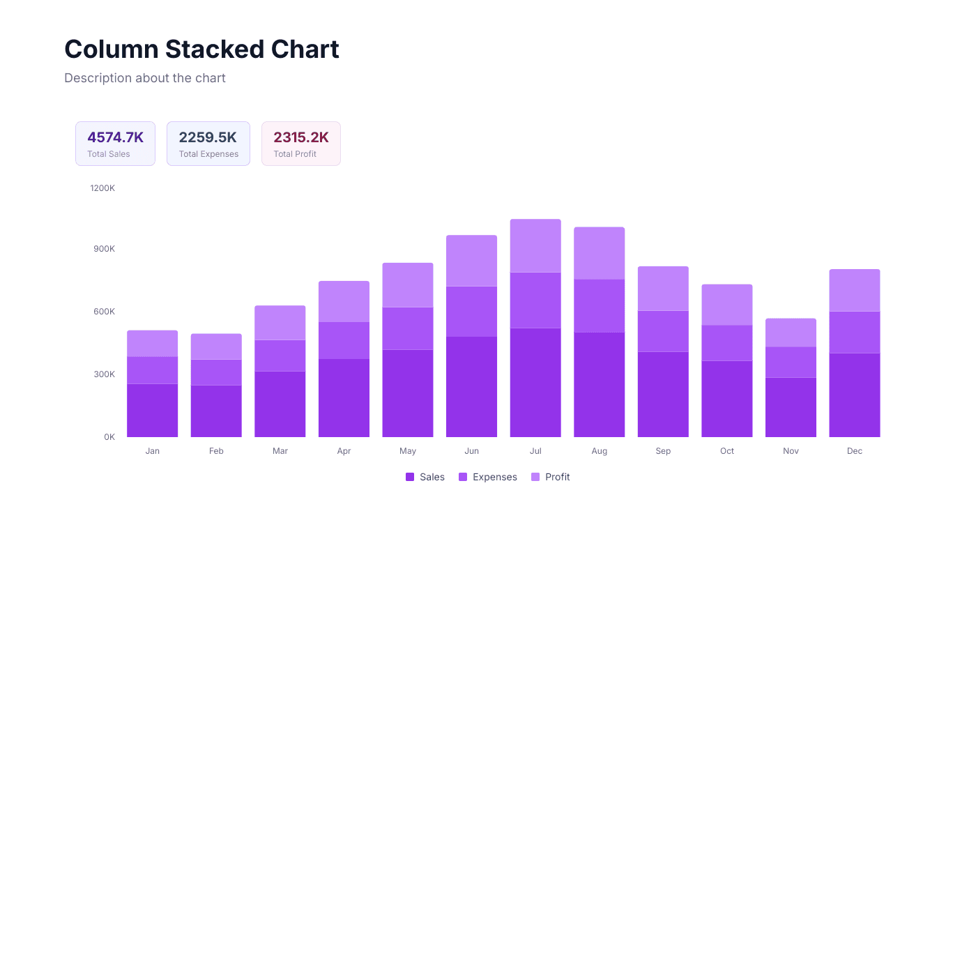
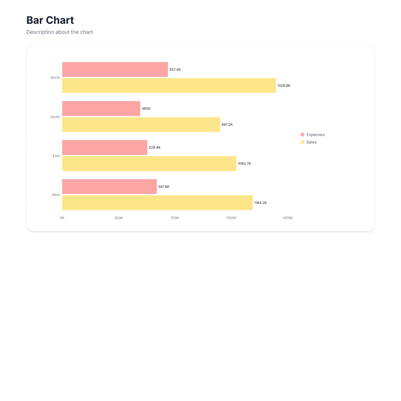
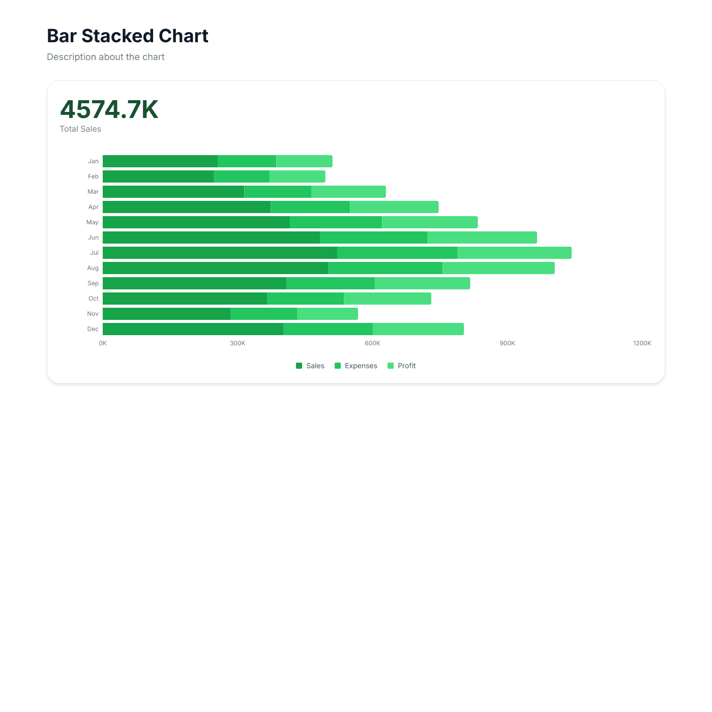
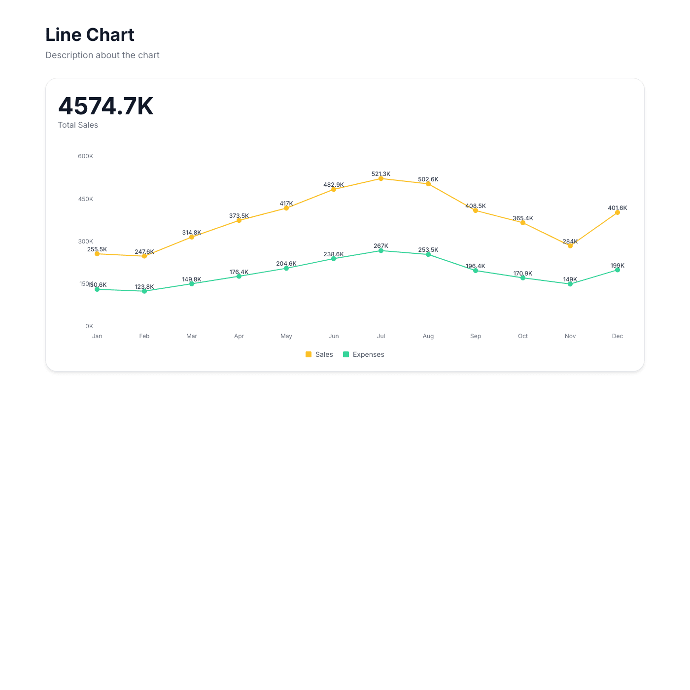
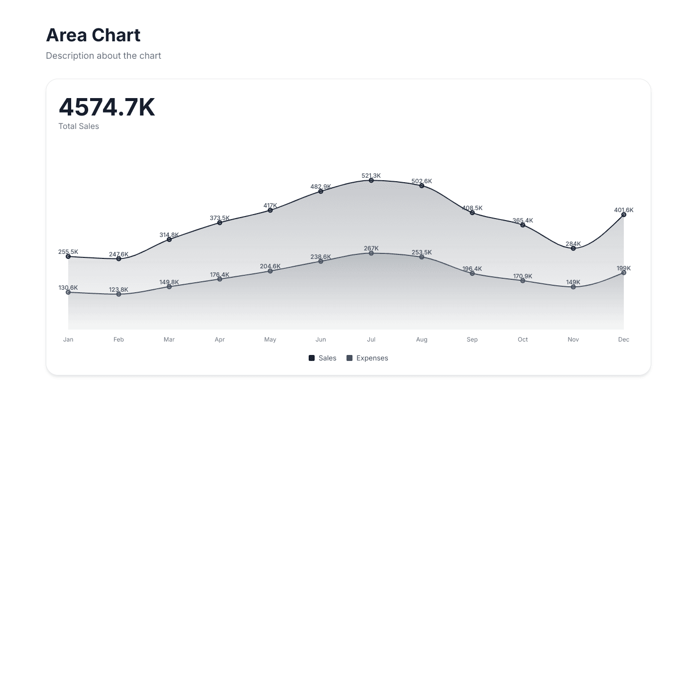
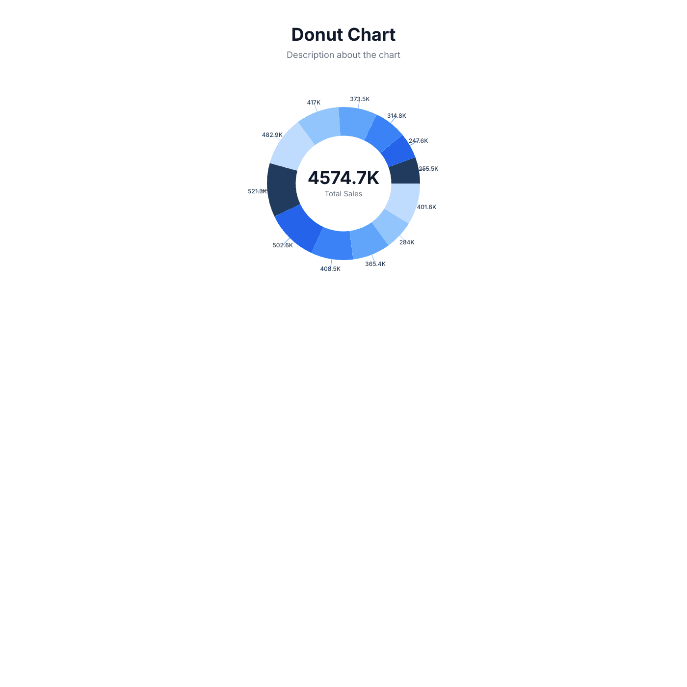
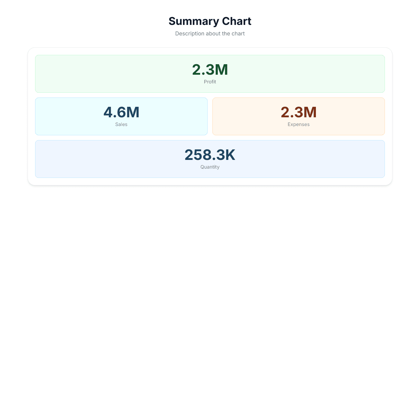
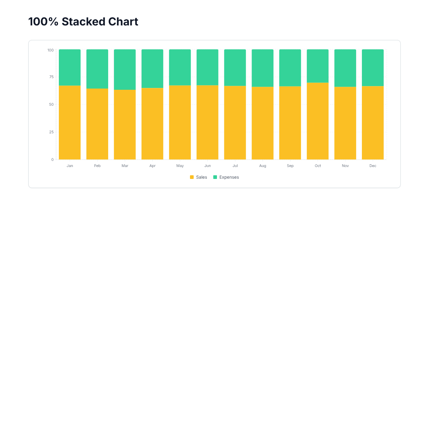
The Right Chart for Every Dataset
Choose from column, bar, line, area, pie, donut, stacked, and summary grid charts. Compare categories with bar charts, track trends with line charts, show proportions with pie charts, or display KPIs with summary grids. Switch chart types anytime without re-entering data.
Match Your Brand Perfectly
Control every visual detail — colors, fonts, grid lines, legends, labels, and tooltips. Set custom color palettes for each data series, adjust axis formatting, and toggle features on or off. No CSS or design skills needed.
“Setup was quick and it's been solid since.”
Samuel
Focus Digital
Always Up to Date
Your charts sync with your spreadsheet automatically. Update a sales figure, add a new month of data, or correct a typo — the embedded chart on your website reflects the change within seconds. No manual exports or screenshot updates.
“Updates sync instantly with my source data.”
Troy Hamthanon
Embed on Any Website
Works with any website builder including Webflow, Squarespace, WordPress, Wix, Notion, and more. Fully responsive charts that resize to fit any container. Just copy and paste the embed code.
“The embeds look great on any site. Total no-brainer.”
Islam Yusri
Aionic Lab
Frequently Asked Questions
A chart widget is an embeddable, interactive chart that displays data from your Airtable or Google Sheet directly on your website. It updates automatically when your spreadsheet data changes, so your charts are always current.
We offer 10 chart types: Column, Stacked Column, 100% Stacked Column, Bar, Stacked Bar, Line, Area, Pie, Donut, and Summary Grid. Each type is designed for different data visualization needs — from trend analysis to proportional comparisons to KPI dashboards.
Most teams already track data in spreadsheets. Instead of learning a complex BI platform, you can turn your existing Airtable or Google Sheet into a live chart on your website. No data migration, no new tools to learn, and updates happen automatically.
Connect your Airtable or Google Sheet, choose a chart type, customize the colors and layout, then copy the embed code. Paste it into your website builder and your chart appears instantly. The whole process takes about 5 minutes.
No coding required. Our visual editor lets you pick chart types, set colors, configure axes, and adjust every detail without writing any code. Just point, click, and customize.
Our chart widget works with any website that supports embed codes, including Webflow, Squarespace, WordPress, Wix, Notion, Framer, Carrd, and custom HTML sites.
Your chart automatically syncs with your Airtable or Google Sheet. When you add rows, update values, or change column names in your spreadsheet, the chart on your website updates within seconds. No manual refresh needed.
Yes, everything is customizable — data series colors, background color, font family and size, grid lines, legend position, axis labels, tooltips, and more. Match your chart perfectly to your website design.
Yes. Column, bar, line, and area charts support multiple data series so you can compare different metrics side by side. Stacked charts let you show how individual series contribute to a total.
Yes, you can get started for free. The free tier includes core features with a small "Powered by" badge. Upgrade to remove branding and unlock advanced features like custom domains and priority support.
Yes. Charts include hover tooltips that show exact values, and legends that let viewers toggle data series on and off. The charts are fully interactive and engaging for your website visitors.
Absolutely. All chart types are fully responsive and resize to fit any container. They look great on desktop, tablet, and mobile devices.
Yes. Built-in aggregation lets you sum, average, count, or find min/max values across your data. This is useful when your spreadsheet has raw transaction data and you want to display summarized totals in your chart.
Yes! Pro and Business plans include custom domain support. You can host your chart on your own domain with free SSL included.
More Widgets
Blog Widget
Create a beautiful, fully customizable blog widget powered by your Airtable or Google Sheets data. Embed anywhere in minutes.
Card Widget
Create beautiful, fully customizable card grids powered by your Airtable or Google Sheets data. Embed anywhere in minutes.
Digital Products Widget
Showcase and sell digital products like eBooks, printables, templates, and courses. Powered by your Airtable or Google Sheets data with buy links to your checkout.